Buildkite
Senior Design Engineer
2024 — Present
At Buildkite I've had the privilege of working on a range of products, from pipeline features to system components to docs and marketing uplifts.
Pipeline Canvas View
Team demo videoThe Build Canvas project began as a team initiative to formalize a hidden internal tool that customers already loved. My role was to lead the design, transforming a basic proof of concept into a polished, first-class feature.
The core challenge was deceptively immense. We had to represent the sheer scale and complexity of pipelines from customers like OpenAI, Anthropic, and Block, who are, in some cases, throwing 13,000 steps into a single pipeline, and handle that in a way that feels natural and manageable.
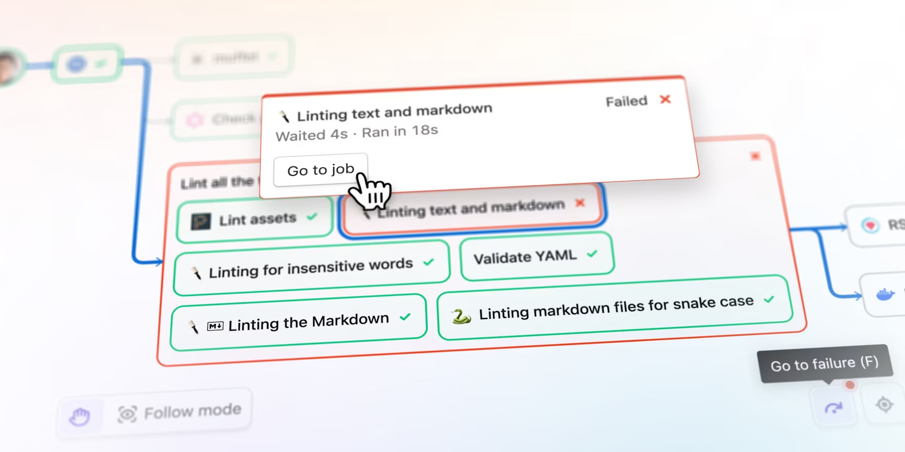
My favorite contribution was creating the "Follow Mode." An engineer had spiked a basic "auto pan" button, and I immediately saw the potential to turn it into a much more delightful and memorable experience.
I designed an interface similar to Figma's "follow" feature, creating a clear, persistent mode that felt instantly familiar to users. I took it a step further, adding elevator music that can be opted into—what seemed like a gimmick at first, but actually helps users know when a build finished when they switch to other tabs.
I designed, coded and shipped the UI into production. It was a small touch that brought personality to the experience, and many customers have told us how much they love it. It even helped unlock Buildkite play DOOM.
The success of this project lies in the countless design problems we solved to make it feel effortless. I spent the majority of my time wrestling with tiny, imperceptible permutations: What happens when you expand a matrix group by a parallelized group? How should the loading state of a retried job look? How should we represent all the different dependency types?
Nailing these tiny interactions is what makes the Canvas work at scale. The result is a feature that feels completely inevitable and is now a core and essential tool for our Pipeline customers.
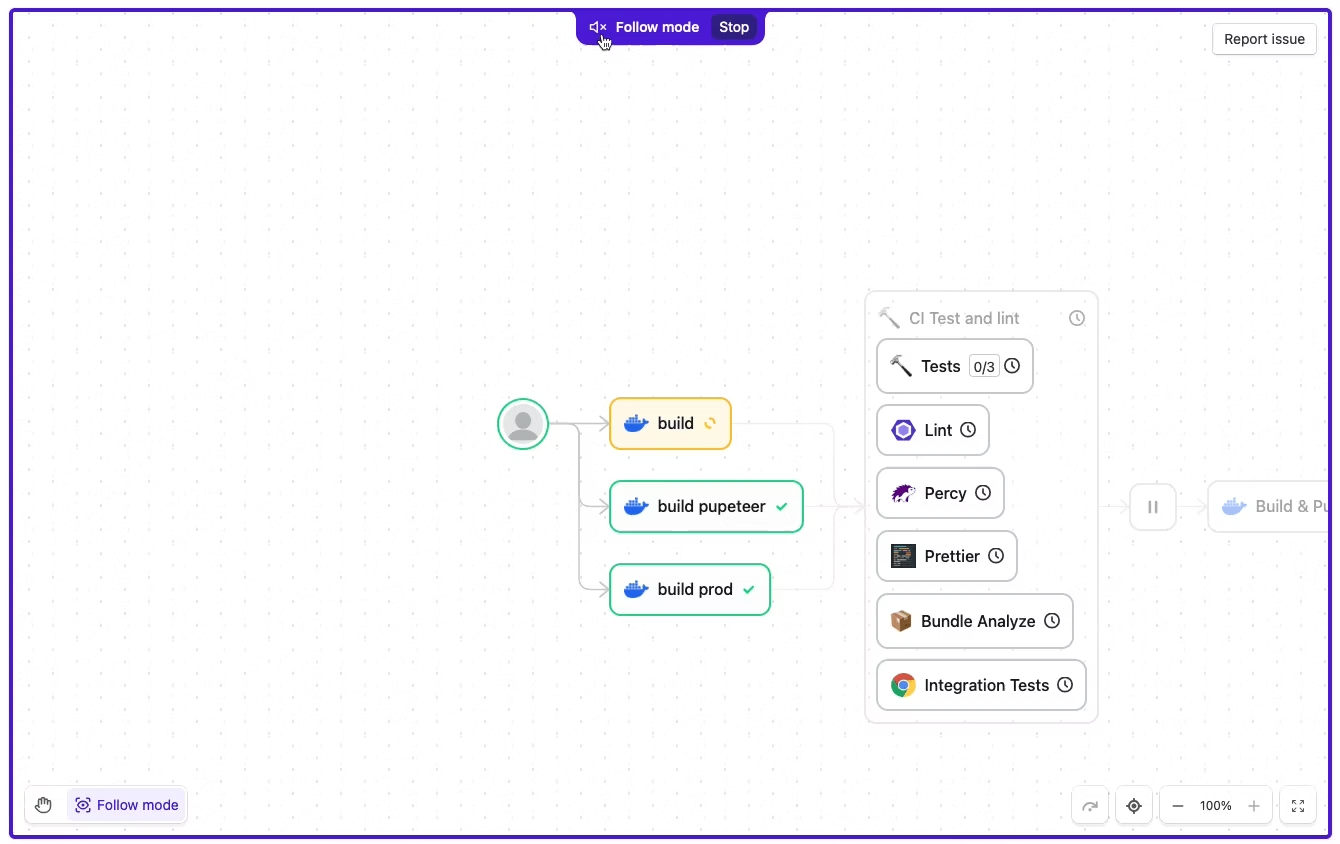
Follow Mode in action
Build Page Redesign
View BETA release postThe Build page redesign set out to evolve Buildkite's cornerstone product to better serve users tackling increasingly complex pipelines. As the sole designer on the project, I partnered closely with a PM and staff engineer to define the vision and direction.
From the beginning, our focus was clear: keep the UI approachable for new users while giving our advanced customers the power and clarity they needed to work at scale.
Interactive build page with resizable panels and improved navigation
The impetus for this redesign grew out of my work on the previous feature, the Pipeline Canvas View. While developing it, we repeatedly encountered the limitations of the legacy Build UI. It became clear that to unlock future capabilities, we needed to address the foundation itself.
I pitched the redesign with my manager, and our direction from there was grounded in many rounds of research, testing, and customer feedback. We learned that while people valued the familiarity of the old UI, its inconsistencies had become a significant bottleneck.
This became the guiding principle: honor the workflows users already knew, while introducing meaningful improvements on that foundation.
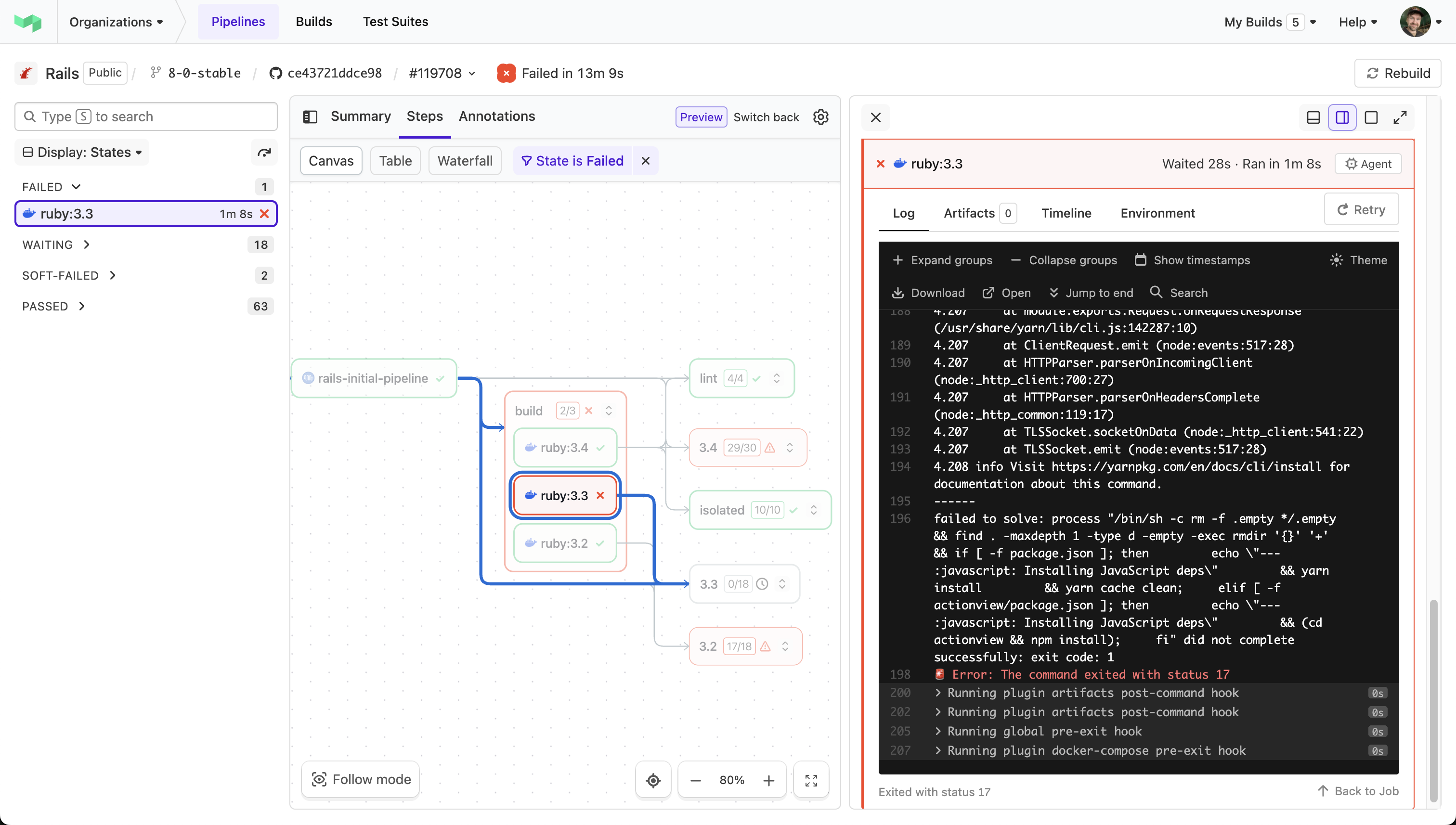
New build interface showing step details and logs
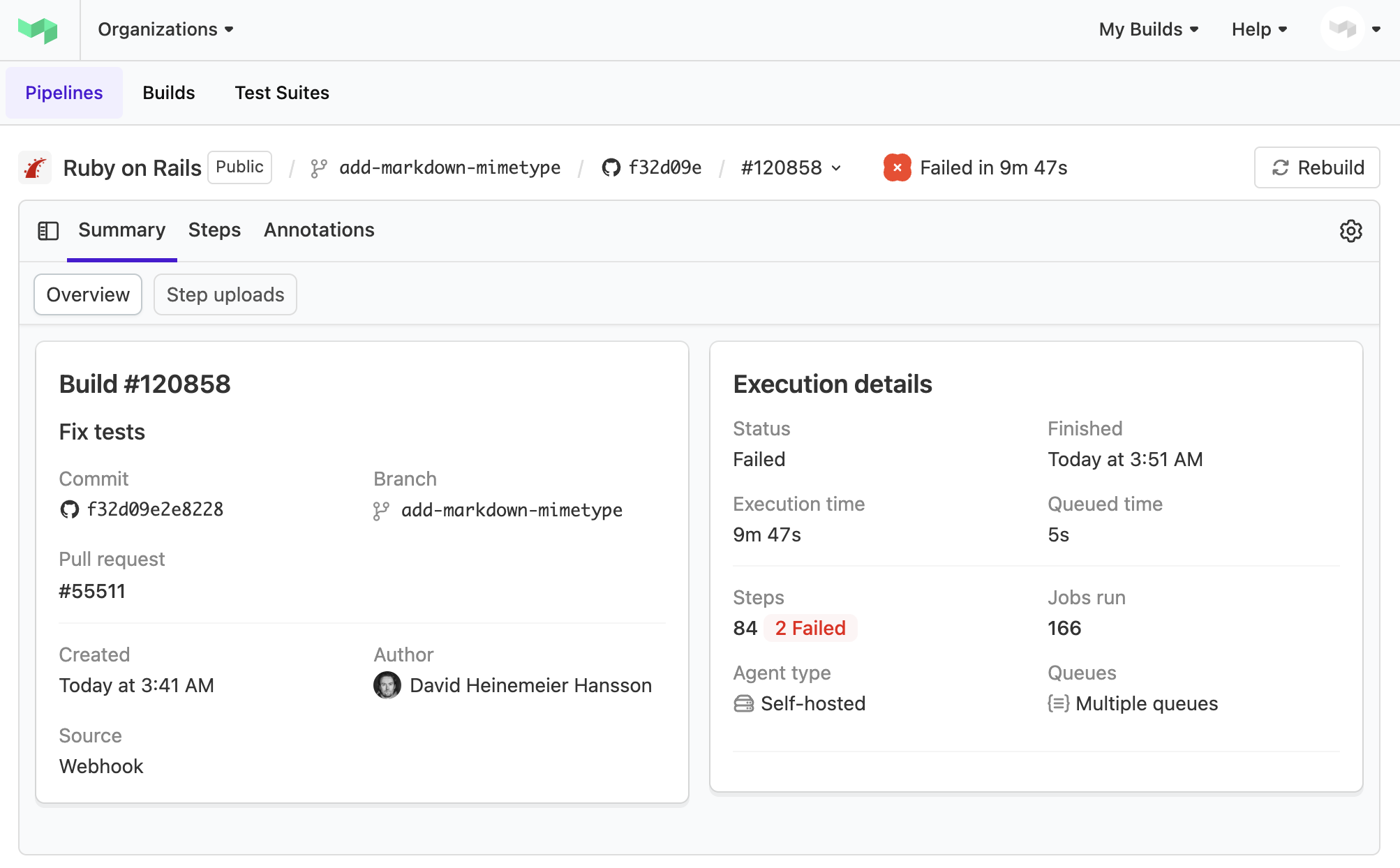
Summary view of a Rails build kicked off by DHH
We built these changes to work with existing workflows while opening doors for what's next. Early adoption looks really positive, and we're using that feedback every day to continue refining it.
The Build UI's journey is unfinished, but we've taken a giant step towards making the product easier to use, more consistent, and more adaptable to meet where our users, and the market, are heading.
Cluster Insights Dashboard
View release postThis project began with a broad, high-level goal: give DevOps teams the insights they need to optimize their CI/CD infrastructure. The initial brief was open-ended, so I took the lead in defining the product vision by facilitating a series of collaborative workshops.
Over three or four cycles, I presented initial concepts to the product manager and engineering team, using their feedback to iteratively refine the information hierarchy and data visualizations until we had a clear, shared direction. This process proved incredibly effective at turning ambiguity into a focused plan, and uncovered a number of new insights and requirements.
I designed a progressive disclosure system that guides teams from problem detection to solution:
- Signal: Four metric cards to spot issues quickly—"Is everything okay?"
- Explore: Interactive charts that show where issues stem from
- Analyze: Detailed breakdowns to understand patterns (we ended up cutting this layer to ship faster)
The idea was simple: each layer gets you closer to taking action. Start broad, then narrow down until you know exactly what to fix.
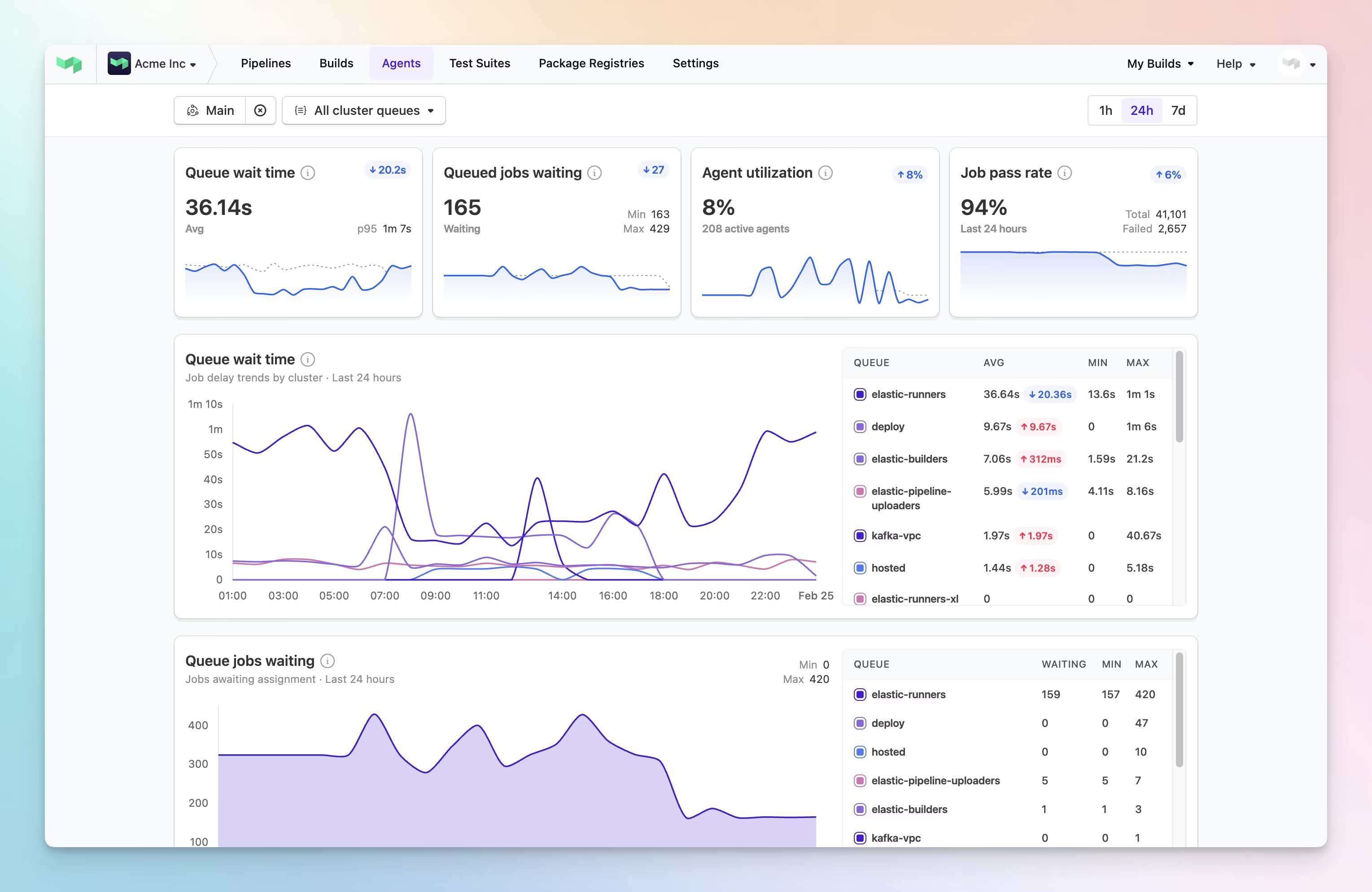
Real-time cluster performance metrics and agent utilization
The final dashboard brings together all the key metrics for cluster and queue health into a single, purpose-built view. Instead of forcing teams to piece this information together, we provided a comprehensive tool to help them spot patterns and fix issues before they impact developers.
The impact was immediate and significant. Reddit told us they loved the feature and that it saved them considerable money on third-party observability tools. More importantly, the dashboard became a key factor in winning Boston Dynamics as a new customer, who told us it provided exactly the insights they needed without having to build a custom solution.
This project was a powerful lesson in how a design-led process can create clarity and drive the direction of a product. By structuring our collaboration through iterative workshops, we were able to transform a loose brief into a feature that not only solved critical user problems but also delivered major wins for the business.
Turns out, when you give teams the right tools to see what's happening with their infrastructure, they can work faster and waste less money.
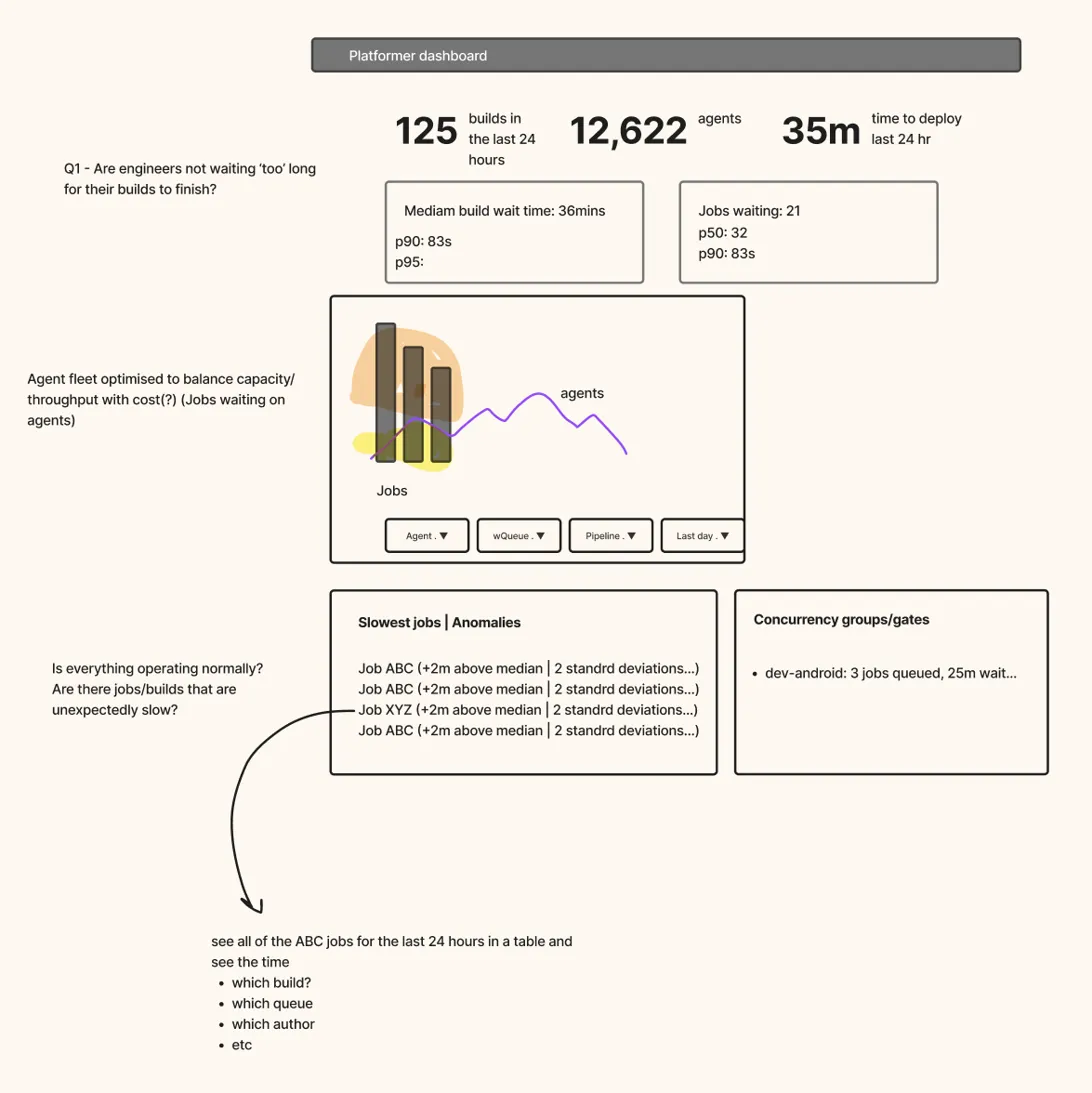
An early wireframe of the 'Platformer Dashboard', prior to becoming the Cluster Insights Dashboard
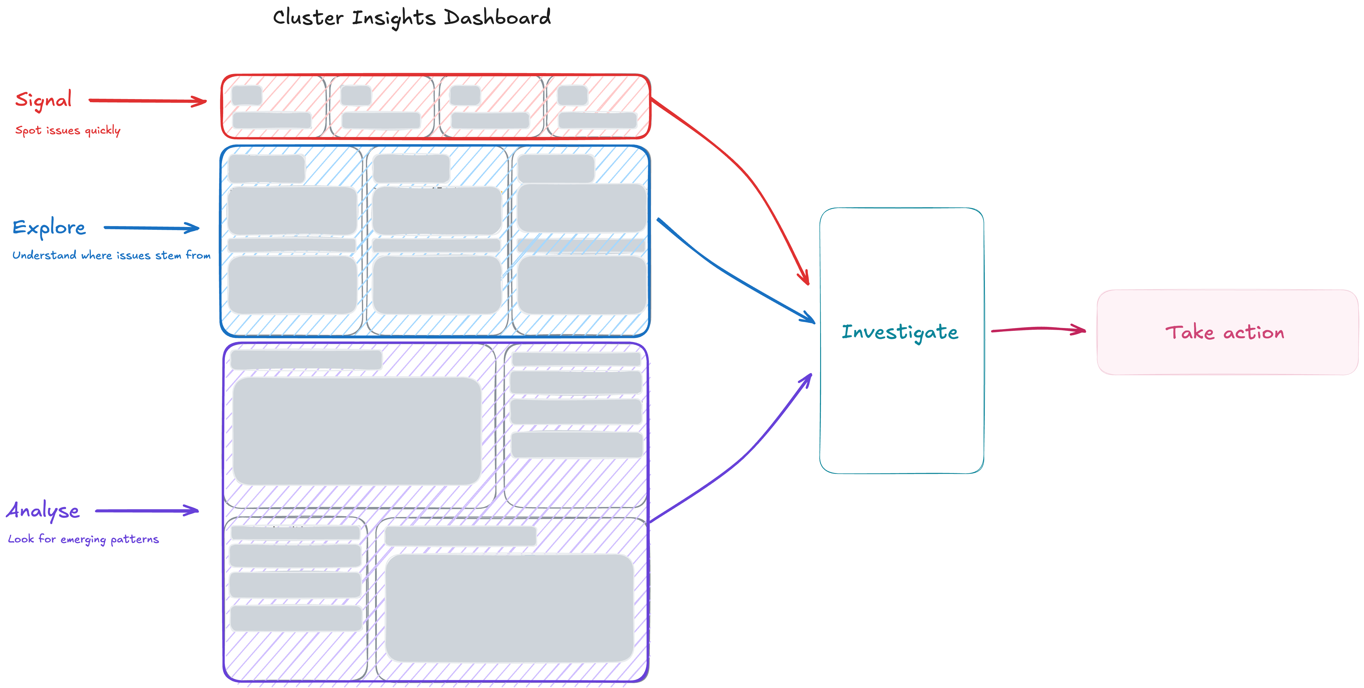
The information hierarchy strategy for the Cluster Insights Dashboard